My Complicated Relationship With Color

It’s pretty obvious to anyone who reads this blog or has known me for any length of time that I gravitate toward a muted color palette.

A few years back I treated myself to a color analysis. Afterwards, I was reminded of something the organization development guru Peter Block said in a lecture: Most people go to therapy, not to change, but hoping they will get confirmation. The result of my color analysis was definitely confirmation.

IMG_0957

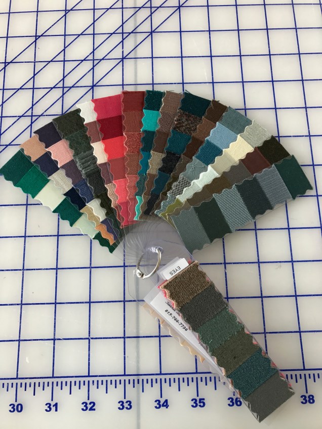
I get a lot of unsolicited advice about branching out to more vibrant colors. Much of this leaves me grumbling about “the color police” and wondering why it matters to people I barely know what I choose to wear. It’s different when I ask for an opinion. Or at least I think so.

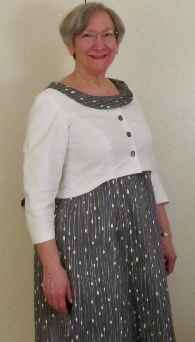
It’s been just over a year since I attended Sarah Veblen’s six-day workshop, Exploring Fashion Design: Design 1. That was a wonderful, but difficult experience for me. I was full of anxiety going in and I reached anxiety overload mid-way through the week. What got to me most wasn’t the stuff I was concerned about before I started (which was sketching and developing a personal croquis with everyone weighing in on the process). Instead, it was the exercises having to do with putting colors together. I just don’t feel I do it well and I’m amazed when other sewists combine colors, patterns and textures with great results. This is the sort of thing that, in the wrong hands can go horribly wrong and I’m convinced that any attempt I make at it will fall into that second category.

Of course, one of the reasons Sarah is such a gifted teacher is because she can zero in on the things her students are unsure about and challenge them to push those limits in a way that is not completely overwhelming. So, one of the exercises she gave me was to find fabrics I like in a color she has long believed would look good on me but I never wear. She calls it salmon. I call it coral. She gave me this assignment on the day we spent at the fabulous store, A Fabric Place. We selected fabrics for our exercises, Sarah cut swatches of them and we presented our assignments to the rest of the group at lunch and at the end of the day (after time for actual shopping, of course). Here is what I came up with for this particular exercise:

IMG_0961

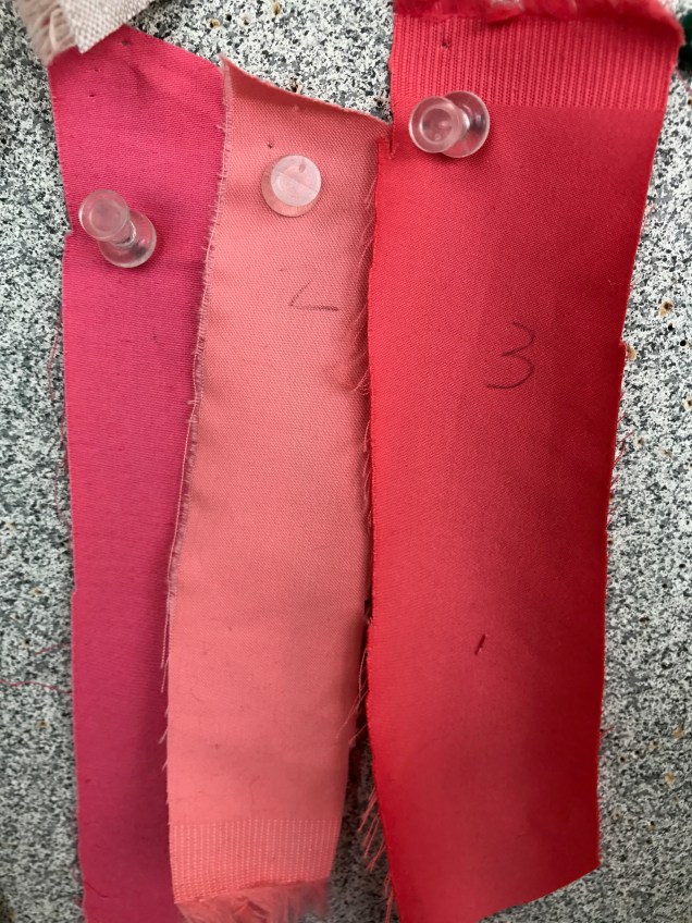
These were the top three swatches once everyone looked them draped over my blouse so they could see them close to my face. (I can’t find that picture. Sorry.) At my request, Sarah and the class ranked them in order of preference so I could use them as a guide.

Since then I’ve bought fabrics in that general color – and sometimes beyond – but I’ve yet to do anything with them.

IMG_0960

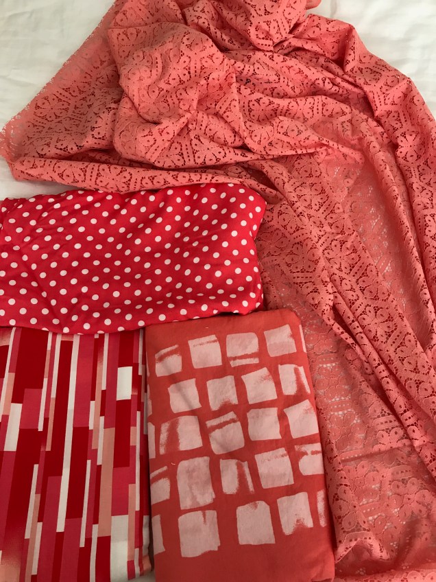
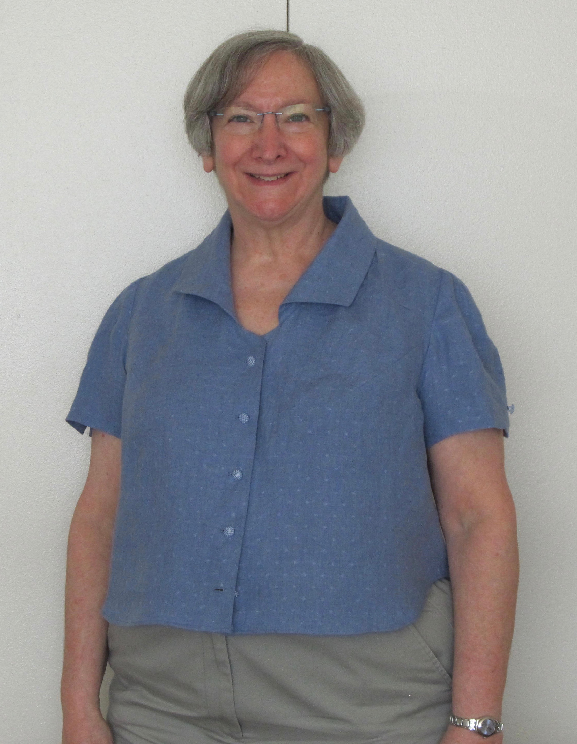
I have plans for this lovely cotton I bought from Louise Cutting’s Cutting Line Designs last summer at the ASG National Conference (bottom center in the picture). I know I want to make another “campish” shirt out of it, but I didn’t get to it last summer. I’m hoping I’l get to it this summer.

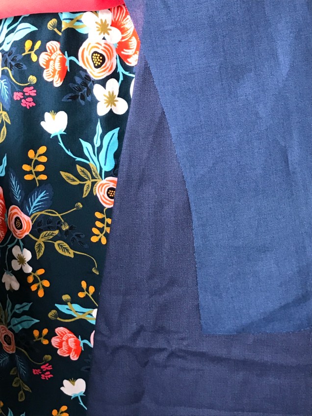
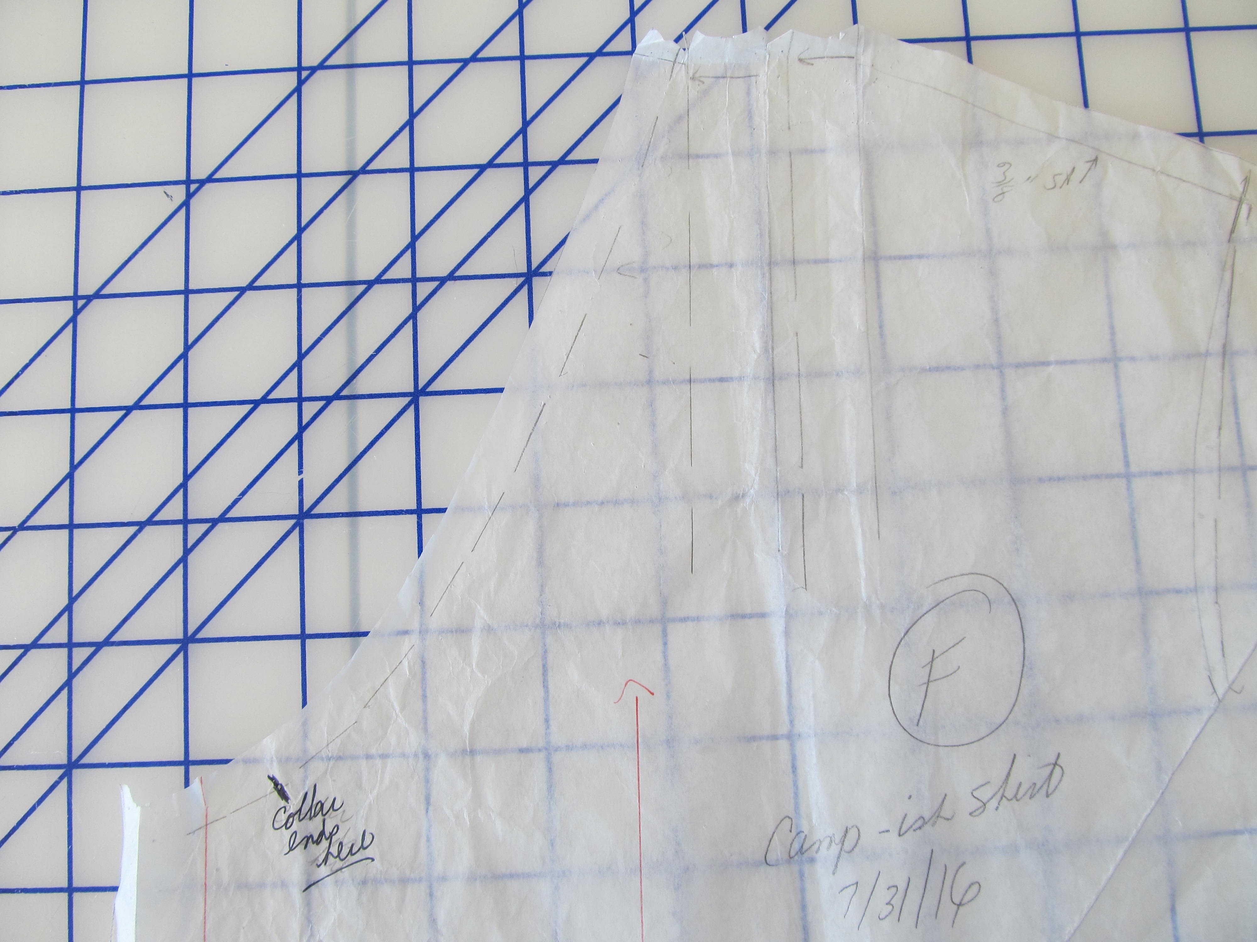
This subject came into focus recently when I was working on a linen blouse to go with a bias skirt I’m going to make out of this pretty rayon challis from Stone Mountain & Daughter.

IMG_0845 (1)

The bright colors and high contrast are definitely unusual for me, but when it came to a color to wear near my face, I reverted to my usual blue.

IMG_0808 (1)

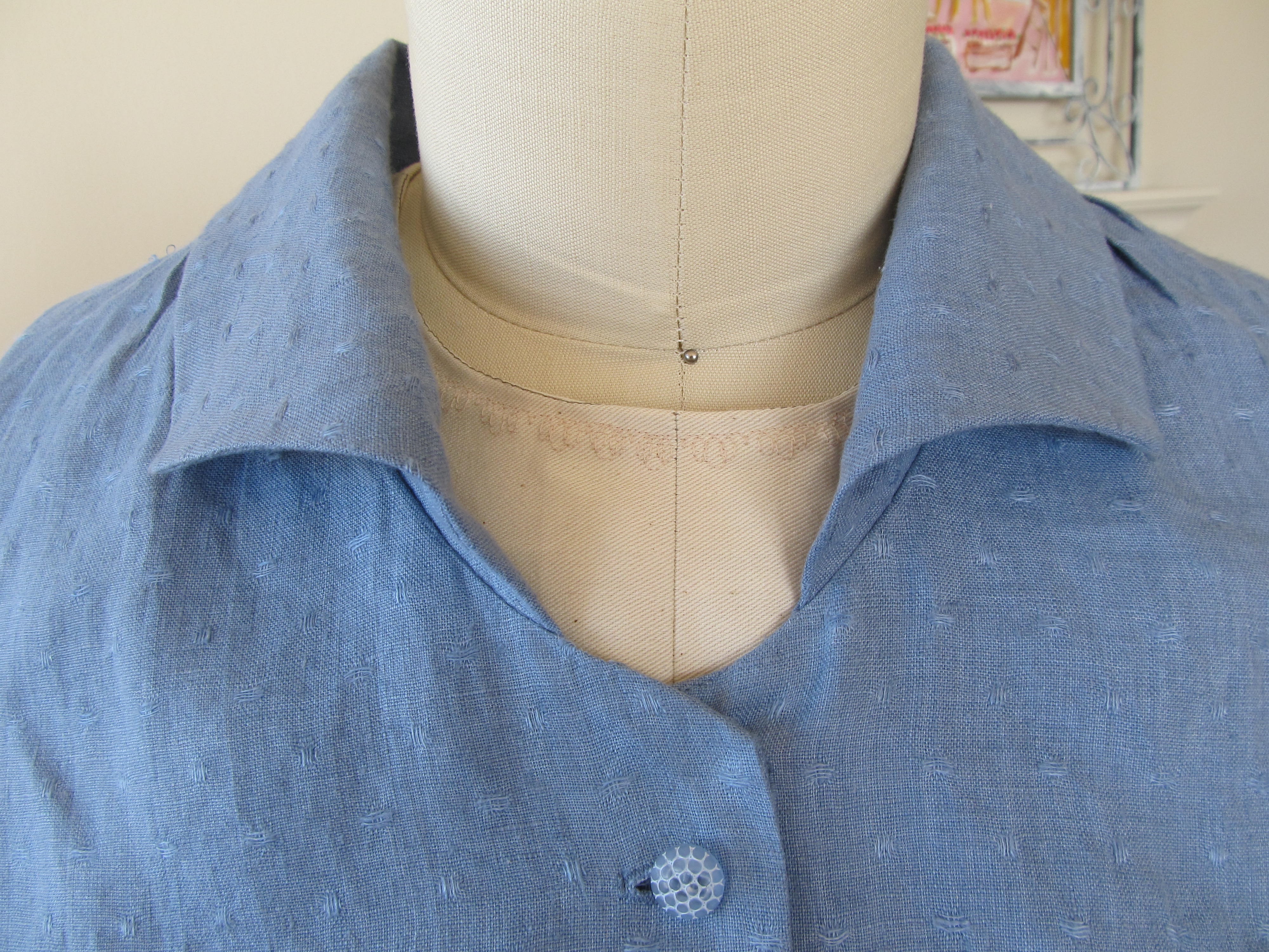
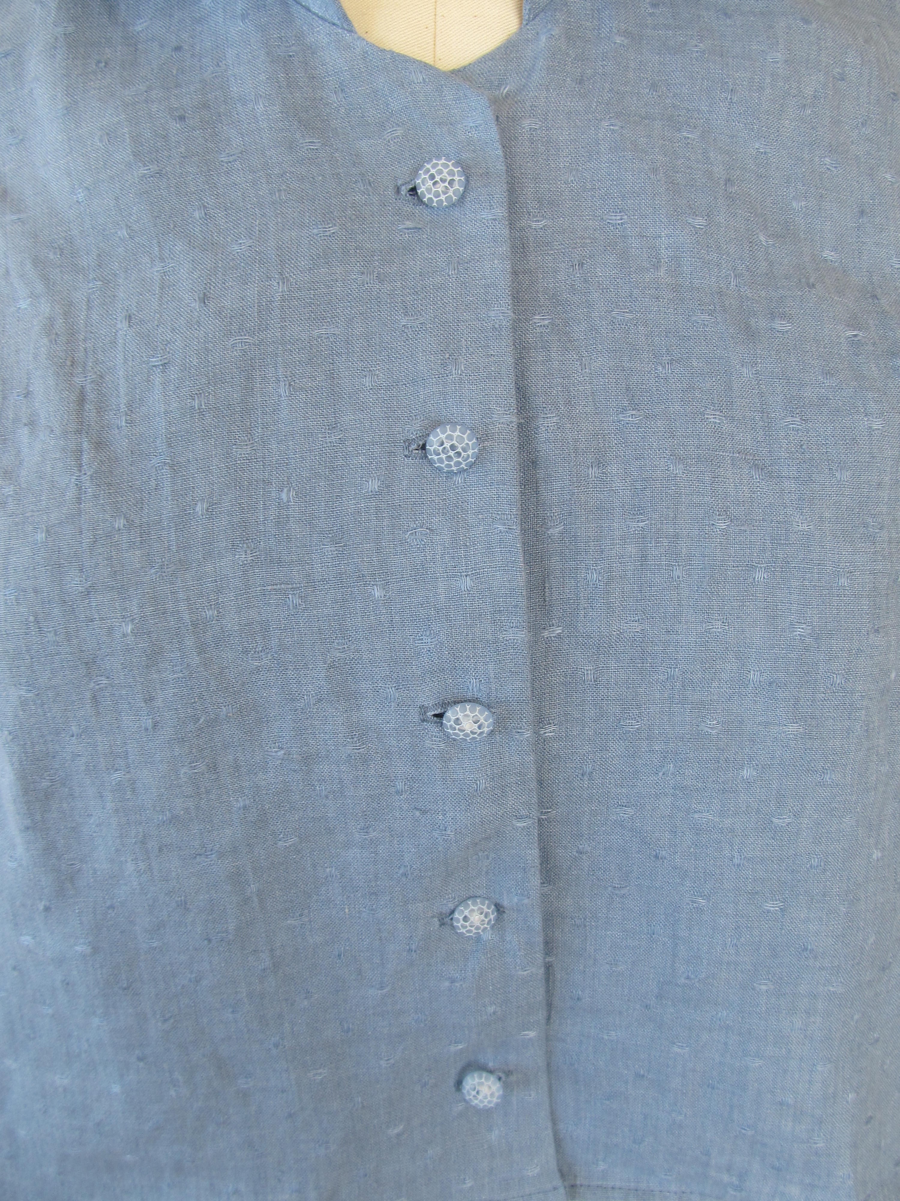
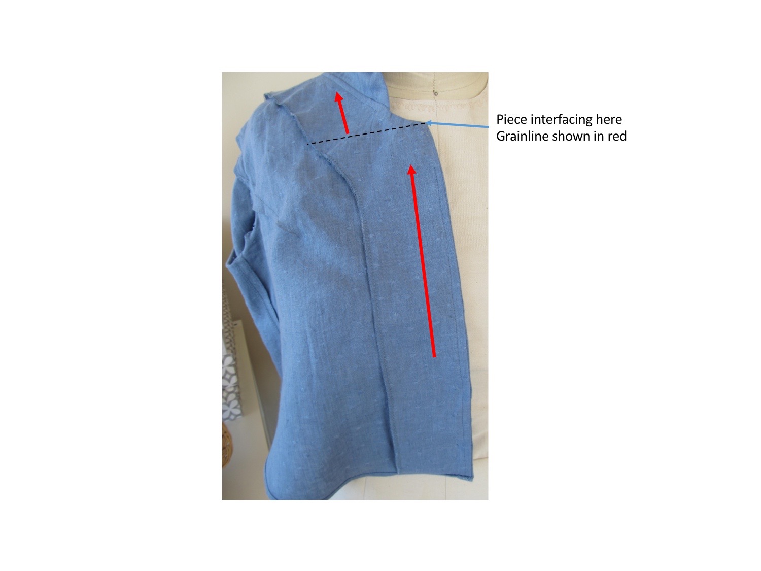
Unfortunately, I discovered some flaws in the blue linen when I was pressing it before sewing. There are streaks and little splotches that are quite a bit lighter than the rest of the fabric, as if the dye didn’t “take” in this spots. It isn’t a question of fading, because the swatch I tested and retested in very hot water and with a hot iron remained colorfast. I looked at the rest of the blouse-weight linen I have, but I felt that none of them would work as well. You know how you just get an image in your head for a project and can’t let it go? So, I took a risk and laid out my pattern pieces to avoid the problem areas, or so I thought. After pre-tucking in the places that needed it, cutting everything out and putting in the final tuck, I started to assemble. In my next pressing, I noticed another streak.

That started a search for another linen I could be excited about for this skirt. Of course, getting the right color online is a tricky proposition. Not everyone goes to the trouble of giving us Pantone colors the way Linda Podietz does on her site, EmmaOneSock.com (thank you Linda!). The result is that I now have an extra supply of linen for future projects. All are very nice, but none of the blues sang out to me. It was the disappointment over the one that didn’t work out, I’m sure, because this one is perfectly fine.

img_0842

But you can see that it’s darker than the fabric I wanted to use.
So I tried branching out into the coral area. At first I thought a bright coral might work because the flowers in the skirt are bright, but that didn’t quite cut it. Besides, it’s a medium weight and more suited to a jacket.

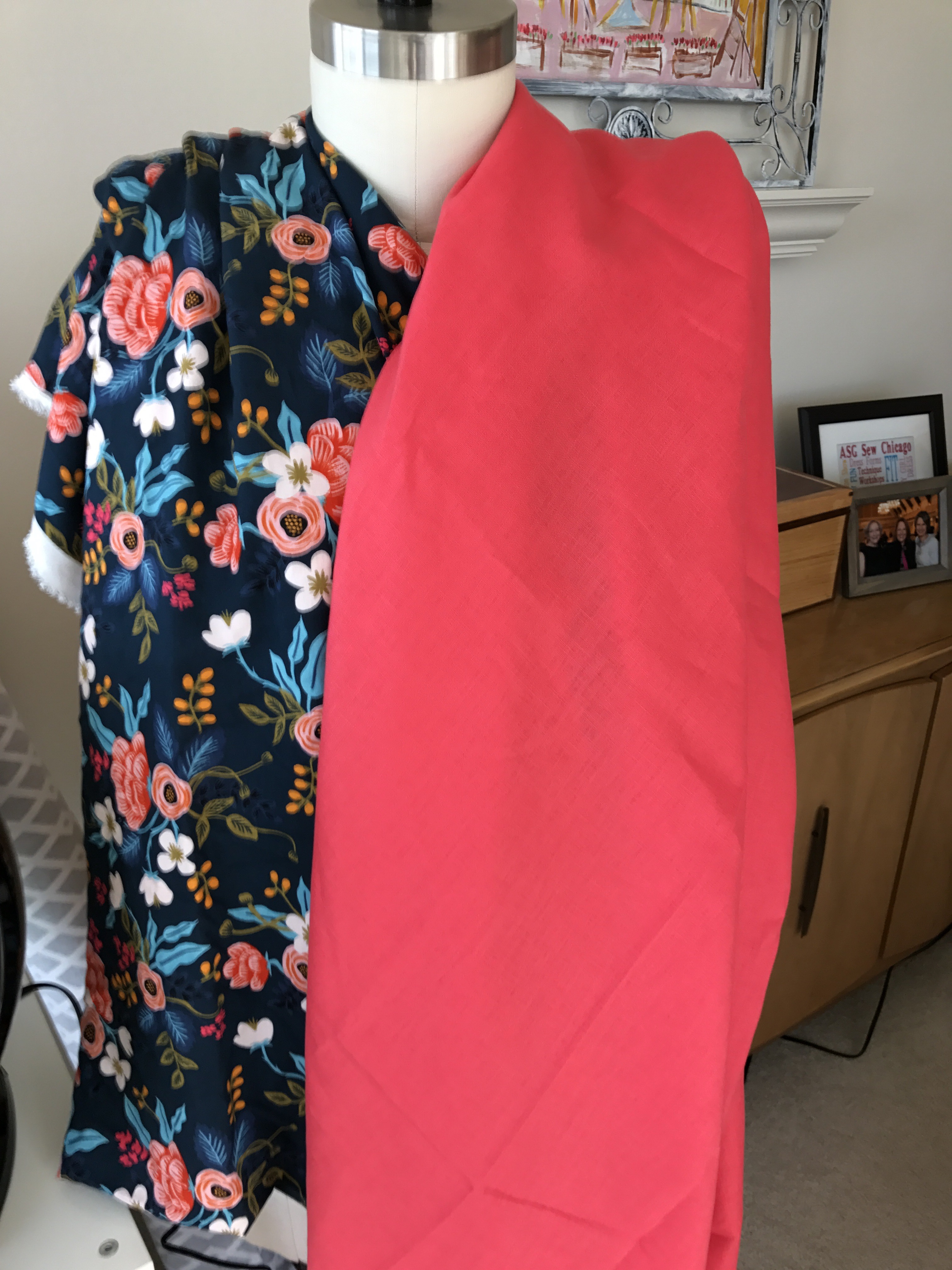
Then I found this cross-dye linen in just the right weight.

IMG_0151

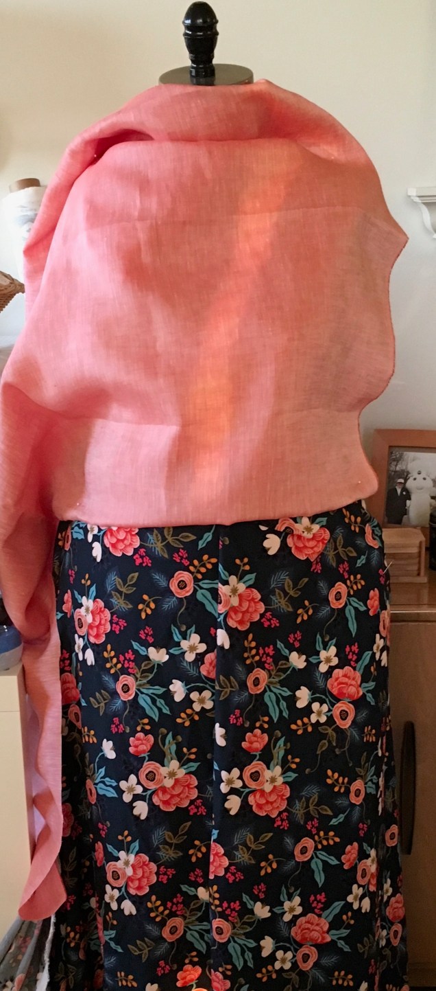
This was my Goldilocks moment.

I can’t wait to cut into both of these fabrics and get this project back on track.

A Jacket to Give a Dress a Second Look

IMG_0006

In a mentoring session with Sarah Veblen last month, we talked about a planned business trip to Brazil. I know the weather will be quite warm, but I need to look polished every day that I’m there. I simply don’t have enough warm weather clothes that fit the bill. One of the suggestions Sarah made was to make a white cotton jacket to wear over the dress I had made for the Spoonflower fabric challenge last summer.  It just so happened that I had two different white piqués in my collection as well as some gray buttons with a white stripe that blend well with the print of the dress.

img_0557-1

All I  needed was some white Ambiance lining and I’d could get started, or so I thought.

The plan was to use the bodice pattern pieces for the Spoonflower dress to make the body of the jacket, with an adjustment at the shoulder to make room for a pair of very thin shoulder pads called “Angel Wings.” The sleeves could be made from either my master jacket pattern or my master blouse pattern, whichever worked. Both are two-piece sleeves. However, I discovered that I no longer had all the pattern pieces for the Spoonflower dress. I started the dress to enter in the October 2015 ASG Chicago Chapter fashion show, but when I couldn’t finish it in time it remained unfinished until last summer. In the interim, I used the pattern as the starting point for my Little Black Dress that I wore in last spring’s Haute Couture Club of Chicago fashion show and to a wedding last June. I didn’t expect to like the Spoonflower dress as much as I do and so I didn’t think I’d want to make another dress from the pattern. So, instead of copying all the pattern pieces to make the modifications for the LBD, I made the changes on the existing pattern pieces. I’ve since decided that I do want to make new versions of the original dress again and I really regretted not taking the few extra minutes to copy all the pattern pieces when we were developing the LBD. That’s a mistake I won’t make again.

So, my first task was to reconstruct the original Spoonflower dress pattern, then copy the bodice pattern pieces adding an extra inch beyond the modified Empire seam of the dress. Because that seam is so curved, I needed to make a faced hem, which required new pattern pieces and interfacing.

I kept everything else very simple. The neckline is the same as the neckline of the dress so that it sits under the dress collar and the top button is hidden. I lined it to the edge and just made interfacing pattern pieces to interface the lining where facings might otherwise have gone, including at center front to support the buttons and buttonholes.

Of the two cuts of piqué that I had in my collection, the traditional birdseye weaves is a bright white and the less traditional one is a softer white. That’s the one that goes better with the dress. In looking at the weave, which looks like a honeycomb, I decided I wanted the elongated pattern to go in a vertical direction in the garment, even though that is the cross-grain.

IMG_0672
In this picture of a sample buttonhole you can see the fabric’s directional honeycomb weave

I also decided that the fabric needed to be cut in a single layer to achieve some degree of consistency at the hemline of the adjacent pieces. That meant making a full pattern for the back piece and remembering to cut mirror images of the front, side and sleeve pieces. I ended up labeling each piece “left front”, “right front”, etc. I didn’t want to leave any room for error.

After doing the pattern work and cutting, I wanted to get sewing, so I put off cutting the lining . This turned out to be helpful, because when the jacket was constructed and I needed to attach the shoulder pads, I went ahead and did all the hand sewing that had to be done on the fashion fabric. That cut down on the amount of hand sewing I had to do at the end and made it less daunting.

After trying on the jacket and determining button placement, it was time to test the  buttonholes. The buttonholes themselves were fine, but I was having trouble getting them placed exactly where they needed to be. With white fabric I didn’t want to take a chance on using a Frixion pen or even a chalk pencil and pin marking was hard to see. So I decided to try cutting painter’s tape to a width that matched the space from the finished edge of the jacket to exactly where I need to sink the needle at the start of the buttonhole.

I marked the horizontal lines in pen and attached the tape to the sample I was working with. I found I could sink the needle in so that it just brushed the edge of the tape and lined up exactly with the pen marking. I’m definitely going to use this technique again.

The other breakthrough in this project was that the lining jump hems didn’t trip me up. I serge finished and pressed under the cut edges, attached them to the serge finished edges of the fashion fabric hems (for the sleeves) and hem facings (for the body), hand stitched them in place and lightly steamed the lining. Done!

IMG_0009

The Campish Shirt

Every summer for the past I’ve-lost-count-of-the-number of years, I’ve wanted to make a camp shirt out of this lovely lightweight linen. This year, as summer was drawing to a close, the stars aligned for me to tackle this project.

Oops. Forgot to button the bottom button.

So why “campish” and not camp shirt? Because I decided that I didn’t want to use a convertible collar that is found in camp shirts. I also didn’t want a patch pocket over the breast. I mean, it’s not as if women are going to put anything in that pocket and I don’t think it really adds anything to the look.

The finished product is not everything I hoped it would be, but I learned some things in making it and now I can share those with you.

First, I learned that the name for the weave of this fabric with the extra texture scattered about is dobby. This particular fabric is pretty loosely woven, which presented some challenges in getting it on grain for cutting and then surprised me by stretching out of shape in one tiny segment of the neckline. More about the headache that created later.

For the pattern, I started out with my no-close topper. I drew a new neckline, added an extension for the button closure, shortened the pattern and added a curved shirt tail hem. When it was finished, I discovered I had shortened it a little too much. This version is wearable, but I’m going to lengthen the pattern before using it again.

I drafted new front and back facing pattern pieces and used the rolled collar and short sleeves with split hem and button detail from the linen version of my shirtdress.

The shirt went together without a hitch, which should have alerted me that there was a problem lurking somewhere. I didn’t mark where the collar was supposed to end in the front. The center back and shoulders were marked and that segment fit perfectly. When I held the collar-to-extension seam sections together they matched after both pinning and sewing, so I thought all was well. I was wrong.

When I put the finished shirt on I wasn’t happy with the way the front neckline looked. Something seemed off about the bit between the end of the collar and center front. I showed it to Sarah Veblen during our next mentoring session and she agreed something was wrong. She compared the pattern piece, which had the end of the collar marked, to the finished shirt and discovered that that little segment of the neckline had stretch more than half an inch. Surprisingly, the interfaced facing had stretched the same amount.

Aug - 2

Sarah’s advice was to unstitch, steam both the fashion fabric and facing into their proper shape and restitch. That included unstitching understitching, removing the top snap and sewing the very last bit at the extension by hand. Can I tell you how much I didn’t want to do that after thinking I was done with the project?

The unstitching wasn’t terribly painful once I got started. It was helped by the fact that I did it with my feline sewing assistant in my lap. The steaming was more of a project than I’d anticipated. It took several rounds of pinning to match the pattern, transferring the pins to hold the fabric to the ironing board cover without the pattern, steaming and leaving it to cool and dry. Little by little, the fullness came out. Then the entire process  had to be repeated for a total of four segments – both sides of the fashion fabric then both front facings.

Aug - 7

One thing I did for the first time with this project was make horizontal buttonholes. I know the “rule” is that you use vertical buttonholes on blouses and shirts and horizontal ones on jackets and coats, but Sarah Veblen encourages her students to ignore that rule. I think she’s right from both a practical and an esthetic point of view. These buttonholes won’t splay open when I move and the buttons won’t come out the way they sometimes do with vertical buttonholes on a fitted blouse. The bonus is that I really like the way they look. I’m sold on using them.

Using the horizontal orientation also meant that I could use keyhole buttonholes for my buttons, which have shanks.

Aug - 6

In looking at the finished product critically, Sarah and I decided on some changes to the pattern before using it again. Besides lengthening it, I’d like to move the tucks out toward the shoulders so they are away from the collar. Sarah also suggested bringing the front armscye seam in just a smudge, which I’ve done. I’m also going to change the shape of the front neckline slightly and widen the collar a bit at the ends so I can get more of the graceful curved shape in front.

Sarah also advised that I modify the way I interface the front facing when using a fabric that might need some extra control. She suggested piecing the interfacing at this line so that this area can be on grain.

Interfacing Diagram

These imperfections aren’t going to stop me from wearing this campish shirt. It’s light, cool, casual and the color is very me.