Storm Blue Dress

IMG_0126

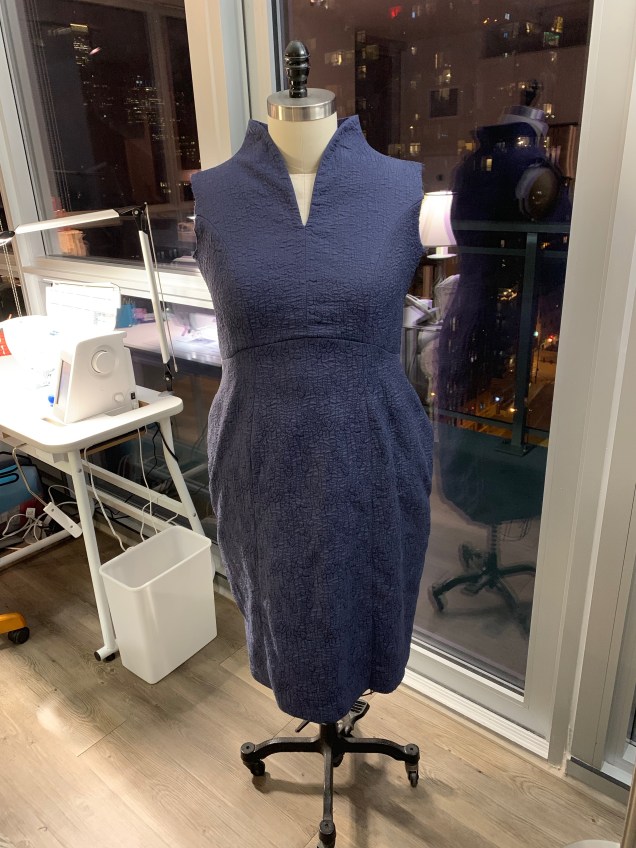
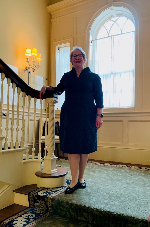
Let’s not dwell on how long it’s been since I’ve completed a project or how long since I’ve blogged. Instead, I’d like to celebrate the latest addition to my handmade wardrobe. It’s a dress that incorporates the raise V neckline I adore and fabulous crinkly rayon in an intriguing shade I’m calling Storm Cloud Blue. This fabric has been aging in my fiber collection for a long time. I’ve lost track of how long ago I bought it at EmmaOneSock. It’s actually a double cloth and the texture is achieved with stitching.

IMG_0128

My original vision was to make this into a dress using this particular neckline, and then I veered off into other directions before coming back to this. I’m glad it took me a long time to start this project because I’ve refined the neckline pattern and found the perfect interfacing to make it work and because I decided to make the body of the dress the same as my LBD. I also decided to echo the tulip-like shape of the neckline with a curved faced hem on the sleeves. I think the combination is just right.

MAFTeQe5R9q8aD4W%X0Qiw

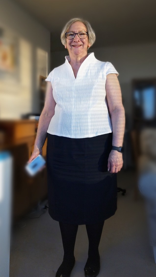
The neckline has been through a couple of revisions since I put it in a lightweight silk blouse that never stayed put and ultimately had to be cut down and then used successfully in my linen Tulip Dress, which is two pieces.


For the white double gauze cotton top I cut the back a bit and discovered that Shirtmaker’s Choice from Islander Sewing Systems (now called Shirtmaker’s Choice Medium) is the perfect interfacing for this design. It gives the neckline enough body to hold its shape without turning it into a stiff board.

IMG_2062

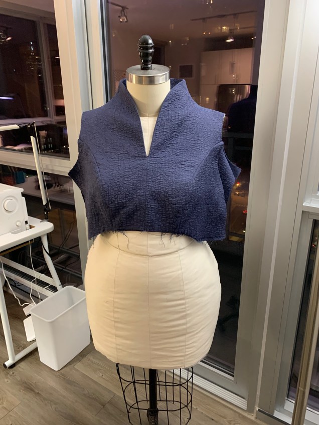
The additional refinement I made to the pattern for this iteration was to do a better job of squaring it off at Center Back so it doesn’t dip at the Center Back seam. The next step was to graft the neck and shoulder onto my bodice master pattern and then to incorporate the curved Empire seam of the Little Black Dress. I also took my master pattern for 2-piece sleeves and incorporated a curved hem and made two hem facing pattern pieces.

With the pattern work done, construction was relatively straightforward after making one more decision. I didn’t line this dress so the question for the bodice was do I make neck facings or simply self-face the entire bodice. I was concerned about the bulk of the fabric, but I tested and decided it was okay to mak a full self-facing so there are no worries about slippage. With this neckline it’s only possible to understitch part of the way because the stitching would be visible about half-way up. The fabric sewed and pressed beautifully. I finished the seam allowances with 3-thread serging.

IMG_0116

When it came to installing the invisible zipper in a side seam, I stitched the first side by machine, hand basted the second side to be sure I got the Empire seam to line up and everything was even at the top and then sewed over it by machine.

IMG_0119

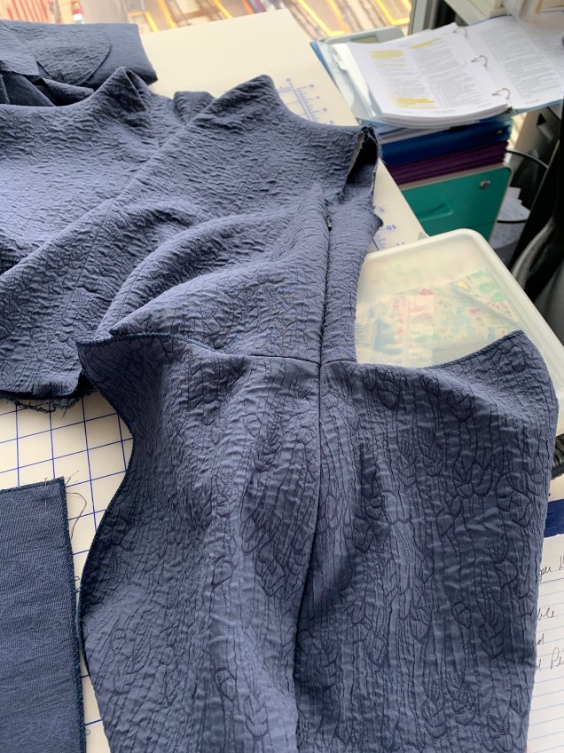
Getting the seam in the two-piece sleeves to line up with the shoulder seam was a bit fussier, so after one attempt to sew it all in by machine failed I sewed in the lower part of the sleeves (princess seam to princess seam) by machine, then pinned the sleeve cap on over a pressing ham for the right shape and attached the caps by hand using a fell stitch.

After attaching the sleeve hem facings (and finding I’d cut two the same and needed to recut the second one), pressing and pinning, I got to work with the hand sewn finishes at the sleeve hem facings and skirt hem.

The result is a dress I feel great in.

IMG_0394


Tucks!

I’ve really missed blogging, but I’ve learned I have to accept that there are just so many things I can stuff into a day and sometimes work and Life simply demand all of my time and energy. It’s not that I haven’t been sewing at all recently, but I have had some misadventures in sewing. More about that in a minute.

For now, I’d like to share my latest completed project.

IMG_1179

It’s the tucked linen top that was inspired by the workshop with Mary Ray that I took through ASG Chicago in January. You may remember this fabric combination from my post about my complicated relationship with color.

This top is almost what I had planned.

The bodice came out just as I had envisioned. I put the top two ¼” tucks in my fabric before cutting out the center front panel. Here is a picture of how this was done when I was using the fabric that I encountered problems with:

I sprayed a bit of Mary Ellen’s Best Press on the linen and pressed in a crease, then stitched at ¼” using my blind hem foot.

It’s had to tell on from these pictures, but the tuck that goes all the way across the front panel just below the neckline is drawn in the pattern and trued at the princess seams.

I was all set to make a neck facing, but Sarah Veblen suggested I line the top in washed China silk, which I did. I also made faced hems for the bodice and sleeves, because I’ve had a problem with linen blouses “cracking” at the hem. It’s this curling thing that happens and no matter how many times you press the darn thing it rolls up again like a window shade. Very annoying! Faced hems are the way to avoid that problem.

For the sleeves, I wanted to convert my usual two-piece sleeve to a one-piece sleeve so I could have a tuck that is not interrupted by a seam (and the problem of getting it to match). Here is the sketch of the design, which I posted several months ago.

img_0026

On me, a one-piece sleeve that’s not a knit requires the tucks you see in the picture because of all the excess fabric in the sleeve cap.

IMG_0168

I was in a tizzy when I got to the sleeves and didn’t pay attention to lining up the sleeve tucks with the blouse tucks, even though that’s the way Sarah draped the sleeve muslin on me. As you can see, I got one side right. Dumb luck!

In the course of this project, I tried to avoid this whole tucks in the sleeve cap issue by developing a sleeve with a crescent-shaped inset at the top, using Sarah’s instructions in Threads Magazine (Vo.192, Sep. 2017 pp.44-45). The mock-up showed me this is a design that does not work on me. Sigh.

But that’s not the only reason I was in a tizzy when I set in the sleeves. The other reason is that I completely forgot to put the tuck in the fabric before I cut out the sleeve.  That’s why there is no tuck across the sleeve in the pictures. Another sigh. And a head shake.

After I finished the blouse, I got another idea for a sleeve that might work. Actually, two ideas. They’re variations on the second inset sleeve design in Sarah’s Threads article:

IMG_0182

One of these just might work.

I’m crazy about the skirt. It’s rayon challis from Stone Mountain & Daughter Fabrics. I took my master pattern for a pencil skirt, which is a six-panel princess and extended each of the seams to make the skirt swishy.

Originally, this skirt was going to be cut on the bias. That was another misadventure I had this summer. The wearable mock-up I made out of another rayon challis was absolutely not wearable. It looked adorable when I tried it on right after I sewed it, but when I left it hanging on my dress form so I could let it relax before hemming, it developed some nasty waves and pouched out in all the wrong places. The lesson from this is that bias does not play well with seams shaped to fit my curves. So, I went back to the drawing board for bias. I have to come up with something for the ASG Chicago Chapter Fashion Show next month, because the Sew Chicago Neighborhood Group Challenge is “Show Your Bias.” I’m working on Plan B this week.

Meanwhile, I have a fun new swishy skirt on the straight of grain and at least another week of warm weather to wear it with my linen top.

IMG_1281 (2)

My Complicated Relationship With Color

It’s pretty obvious to anyone who reads this blog or has known me for any length of time that I gravitate toward a muted color palette.

A few years back I treated myself to a color analysis. Afterwards, I was reminded of something the organization development guru Peter Block said in a lecture: Most people go to therapy, not to change, but hoping they will get confirmation. The result of my color analysis was definitely confirmation.

IMG_0957

I get a lot of unsolicited advice about branching out to more vibrant colors. Much of this leaves me grumbling about “the color police” and wondering why it matters to people I barely know what I choose to wear. It’s different when I ask for an opinion. Or at least I think so.

It’s been just over a year since I attended Sarah Veblen’s six-day workshop, Exploring Fashion Design: Design 1. That was a wonderful, but difficult experience for me. I was full of anxiety going in and I reached anxiety overload mid-way through the week. What got to me most wasn’t the stuff I was concerned about before I started (which was sketching and developing a personal croquis with everyone weighing in on the process). Instead, it was the exercises having to do with putting colors together. I just don’t feel I do it well and I’m amazed when other sewists combine colors, patterns and textures with great results. This is the sort of thing that, in the wrong hands can go horribly wrong and I’m convinced that any attempt I make at it will fall into that second category.

Of course, one of the reasons Sarah is such a gifted teacher is because she can zero in on the things her students are unsure about and challenge them to push those limits in a way that is not completely overwhelming. So, one of the exercises she gave me was to find fabrics I like in a color she has long believed would look good on me but I never wear. She calls it salmon. I call it coral. She gave me this assignment on the day we spent at the fabulous store, A Fabric Place. We selected fabrics for our exercises, Sarah cut swatches of them and we presented our assignments to the rest of the group at lunch and at the end of the day (after time for actual shopping, of course). Here is what I came up with for this particular exercise:

IMG_0961

These were the top three swatches once everyone looked them draped over my blouse so they could see them close to my face. (I can’t find that picture. Sorry.) At my request, Sarah and the class ranked them in order of preference so I could use them as a guide.

Since then I’ve bought fabrics in that general color – and sometimes beyond – but I’ve yet to do anything with them.

IMG_0960

I have plans for this lovely cotton I bought from Louise Cutting’s Cutting Line Designs last summer at the ASG National Conference (bottom center in the picture). I know I want to make another “campish” shirt out of it, but I didn’t get to it last summer. I’m hoping I’l get to it this summer.

This subject came into focus recently when I was working on a linen blouse to go with a bias skirt I’m going to make out of this pretty rayon challis from Stone Mountain & Daughter.

IMG_0845 (1)

The bright colors and high contrast are definitely unusual for me, but when it came to a color to wear near my face, I reverted to my usual blue.

IMG_0808 (1)

Unfortunately, I discovered some flaws in the blue linen when I was pressing it before sewing. There are streaks and little splotches that are quite a bit lighter than the rest of the fabric, as if the dye didn’t “take” in this spots. It isn’t a question of fading, because the swatch I tested and retested in very hot water and with a hot iron remained colorfast. I looked at the rest of the blouse-weight linen I have, but I felt that none of them would work as well. You know how you just get an image in your head for a project and can’t let it go? So, I took a risk and laid out my pattern pieces to avoid the problem areas, or so I thought. After pre-tucking in the places that needed it, cutting everything out and putting in the final tuck, I started to assemble. In my next pressing, I noticed another streak.

That started a search for another linen I could be excited about for this skirt. Of course, getting the right color online is a tricky proposition. Not everyone goes to the trouble of giving us Pantone colors the way Linda Podietz does on her site, EmmaOneSock.com (thank you Linda!). The result is that I now have an extra supply of linen for future projects. All are very nice, but none of the blues sang out to me. It was the disappointment over the one that didn’t work out, I’m sure, because this one is perfectly fine.

img_0842

But you can see that it’s darker than the fabric I wanted to use.
So I tried branching out into the coral area. At first I thought a bright coral might work because the flowers in the skirt are bright, but that didn’t quite cut it. Besides, it’s a medium weight and more suited to a jacket.

Then I found this cross-dye linen in just the right weight.

IMG_0151

This was my Goldilocks moment.

I can’t wait to cut into both of these fabrics and get this project back on track.